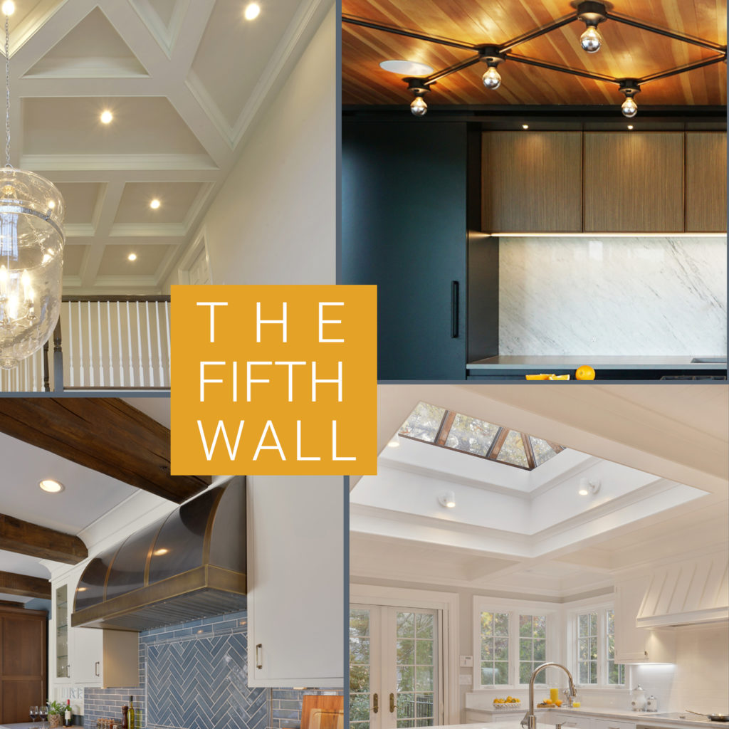
The Fifth Wall
Albert Hadley famously remarked, “Ceilings must always be considered. They are the most neglected surface in a room.”
Designers and architects have long considered the ceiling to be the fifth wall of a room, worthy of as much attention as you’d pay to the other four walls. This is not a new concept. Prehistoric man filled every surface of his cave with depictions of his everyday life. One of Michelangelo’s greatest works of art was his ceiling for the Sistine Chapel. Kings and titans of business alike flaunted their wealth with ostentatious ceiling moldings and carvings, all dressed in gold leaf. While Victorian era homes mostly eschewed the gold leaf, they still featured elaborate plaster ceiling medallions, rosettes and moldings, along with embossed tin tiles. When modernism and tract housing became popular, fifth wall excess fell out of favor, though many builders, architects, and homeowners continued to “dress up” their rooms with crown molding at the ceiling line.

However, there has been a decided return of interest in ceiling embellishment. I attribute this in part to platforms such as Houzz and Pinterest, as well as widely-viewed home improvement TV programs, all of which give homeowners an opportunity to better visualize what effect these architectural devices will have on their spaces. Bilotta designer Fabrice Garson conveys his philosophy on ceiling design: since humans perceive spaces in three dimensions, the ceiling should be as much as part of the initial planning as the walls and floor.

When you walk into a room, you should experience all the surfaces as a unified design that relates to all the other rooms in the house. It’s no surprise, then, that so many of our Bilotta designers were eager to share their ideas and projects about all the ways to add interest, depth, and dimension to your renovation project.
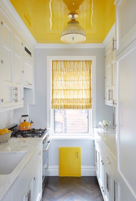
Probably the easiest way to draw attention upwards is with paint. Remember when sky and cloud murals were all the rage? Honestly, I still love that and would do it on a covered porch or a kid’s bedroom in a hot second. But you don’t have to hire an artist to make an impact. One of designer Aston Smith’s favorite projects started life as a typical NYC prewar galley kitchen, so narrow that it didn’t even allow for full-depth cabinetry on both sides. A little trickery with the framing during reconstruction gave them the opportunity to place the refrigerator on the opposite wall, giving them some breathing room and added countertop surface. The positive aspect of these classic apartments is the extraordinarily high ceilings, so Aston naturally took advantage of this by taking the cabinetry all the way up to gain the extra storage. White cabinets and pale walls brightened the space, but it still felt like a long tunnel, with no wall space left for artwork or personalization. The transformative touch? A swath of high-gloss saturated yellow paint, with the cheery hue repeated on the window treatment and access panel below. Now the eye is distracted away from the length of the room and is instead directed toward its volume.
Even if you’ve never seen a single episode of “Fixer Upper” (and I must admit that I’m one of those people), you most likely know about the frenzy that Chip and Joanna Gaines caused over shiplap siding on interior walls. They certainly didn’t invent it, but they sure did popularize it. Senior designer Danielle Florie says we shouldn’t just think of it for walls; she loves it on ceilings as well! The shadow lines add depth and texture and are a bit fresher looking than the beadboard ceilings more typical of older or traditional homes.
Designer David Arnoff is also a fan of beadboard ceilings for their vintage appeal. And both David and Danielle Florie mentioned tin ceilings as a time-honored favorite. Danielle recently completed a kitchen renovation in a stately old Bronxville home where tin ceilings were used to evoke a bygone era. Danielle even used it in a previous home of her own: a beautiful 1902 Victorian style where she wanted to honor the origins of the structure despite the up-to-date kitchen she was adding.
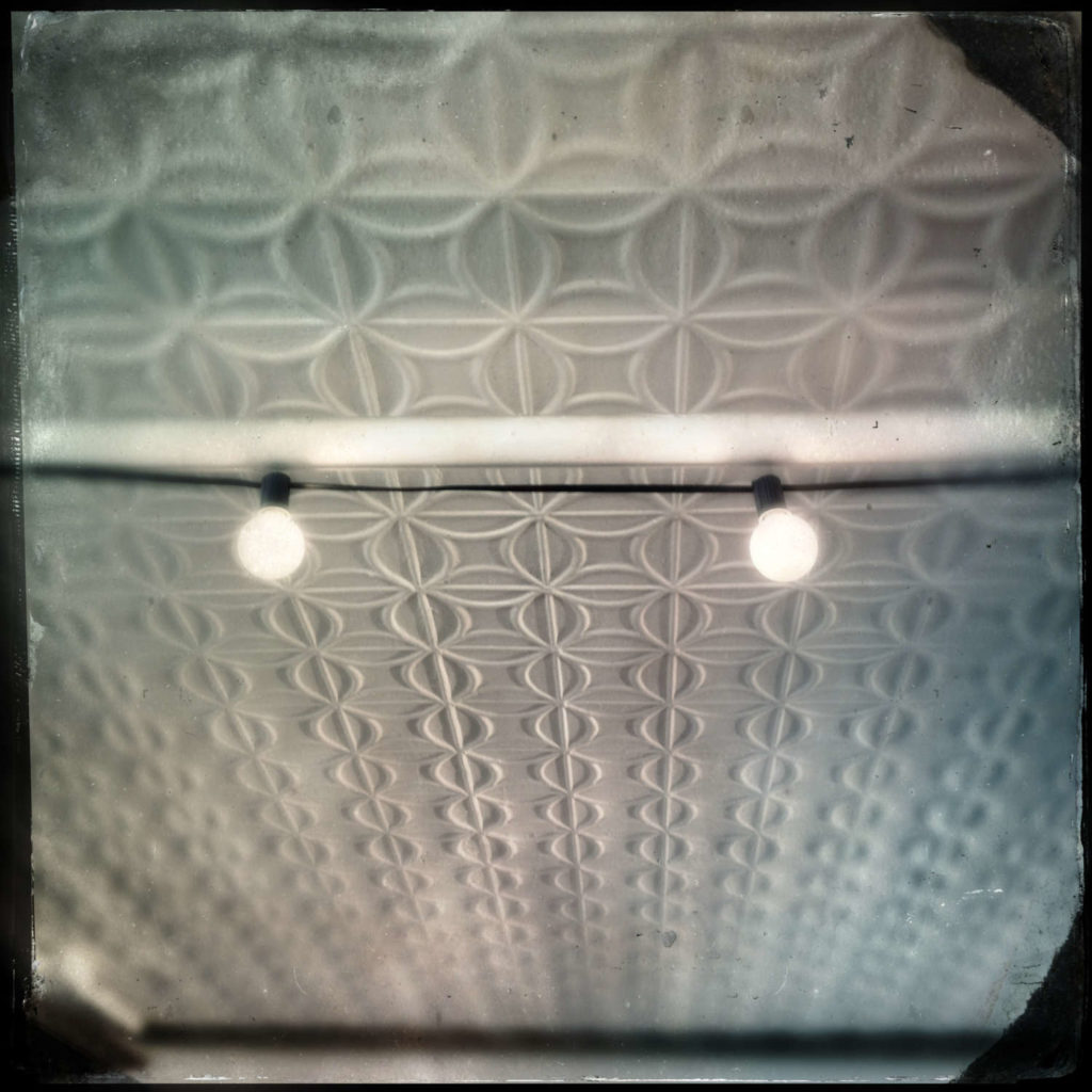
To look up and see the beautiful intricate patterning instead of plain sheetrock is a visual delight. Tin ceiling tiles are also available in other finishes, such as copper. And if you like the idea of the textural motif but not the metallic surface, there are embossed wallpapers that mimic the look of the original tin material but can be painted any color that suits your décor.
When I say, “dropped ceiling” or “soffit”, do you think of suspended acoustic tiles in your parents’ basement, or the unimaginative sheet-rocked bulkheads above squatty kitchen cabinets? Well, think again, because the following two examples will re-define the genres.
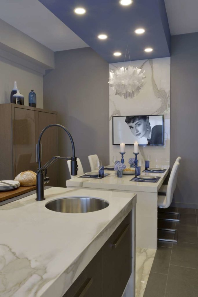
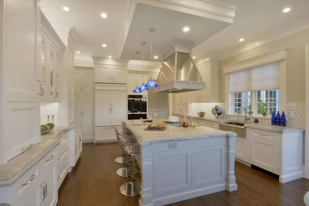
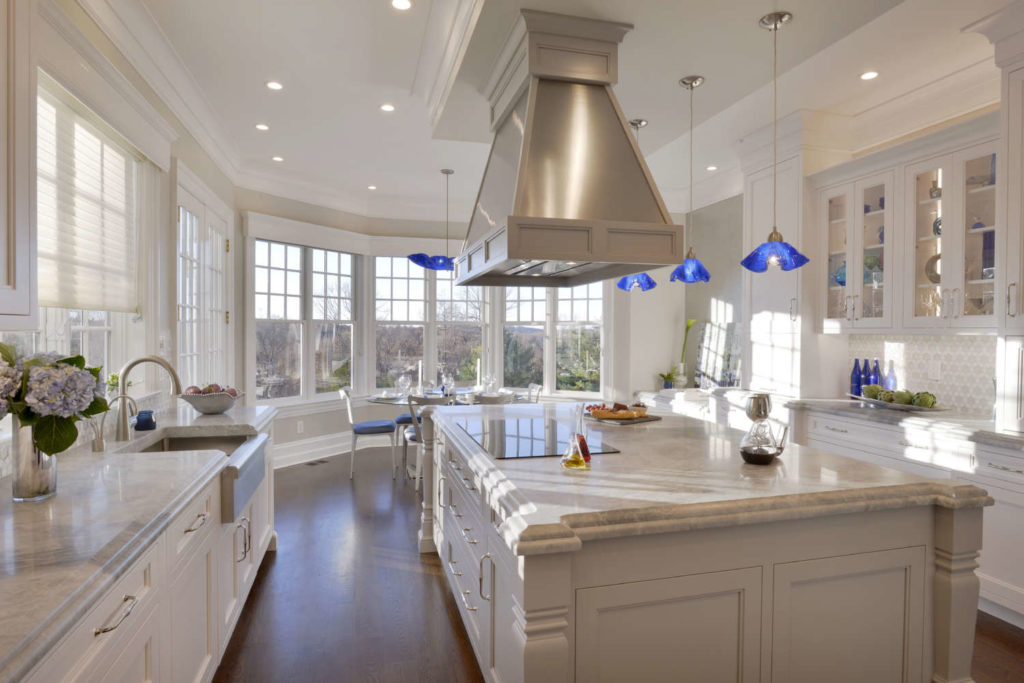
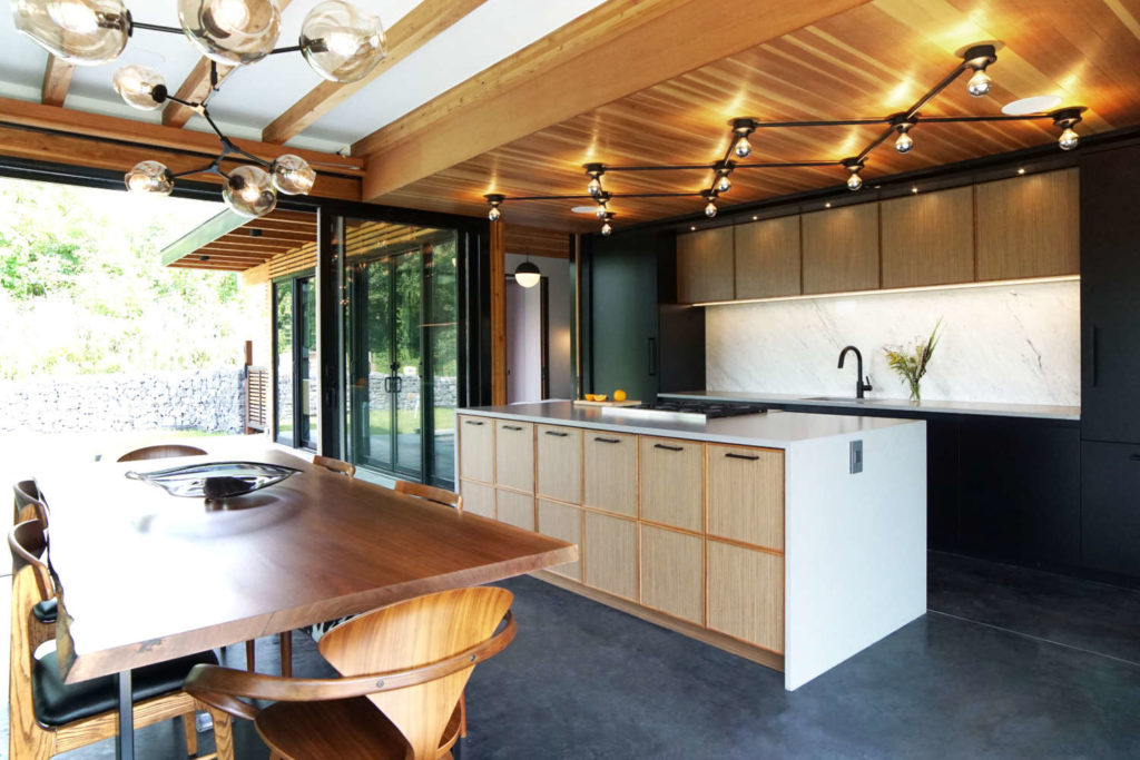
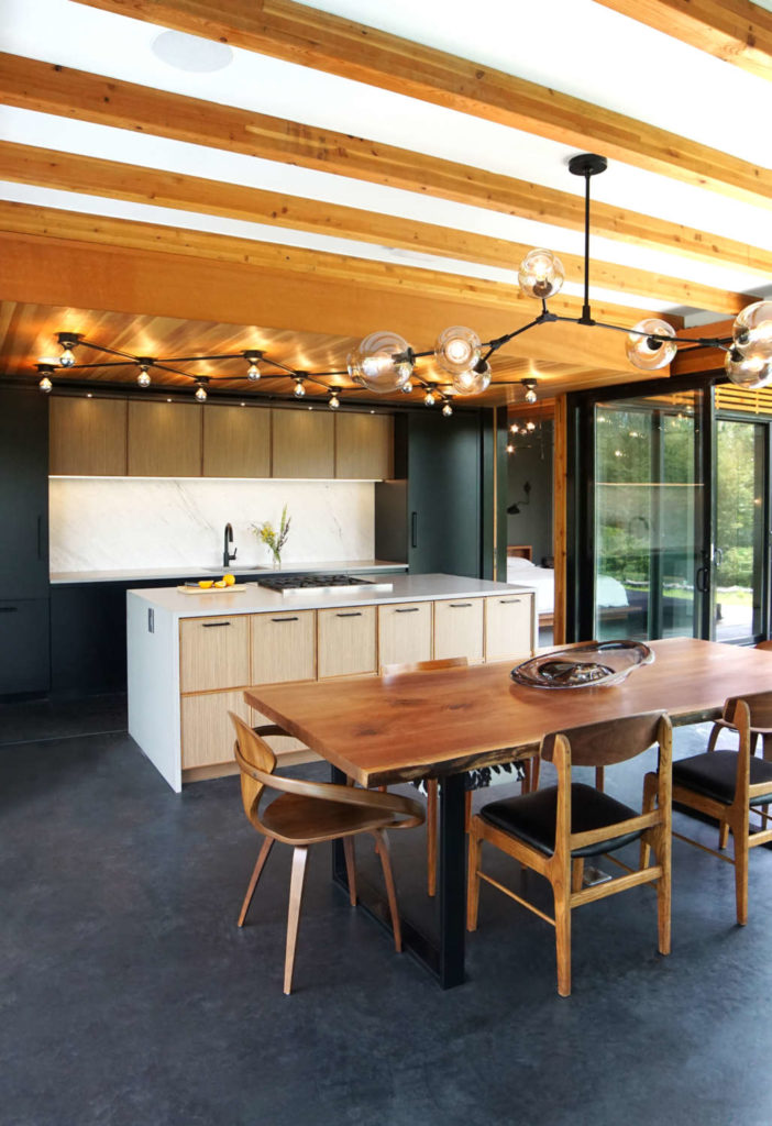
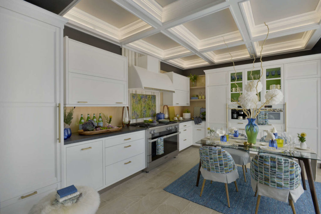
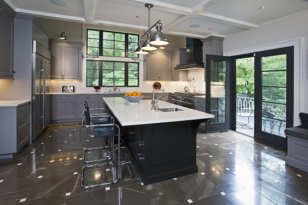
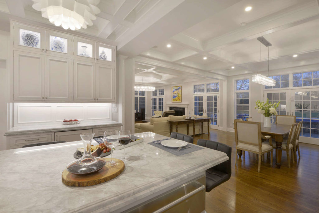
In our flagship Mamaroneck showroom, Fabrice Garson used a dropped ceiling to reinforce his design concept for the display. The room is long and the main traffic pattern through the showroom cuts directly through the space.
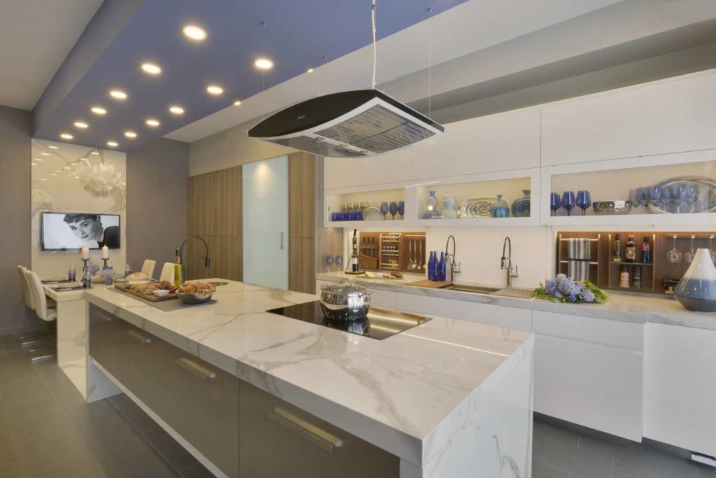
Fabrice wanted the two sections to feel unified, so he aligned the island and dining table, designing them from the same marble with waterfall ends. He connected them with a piece of marble inlaid into the wood floor, then ran the marble right up the wall behind the table. The soffit/dropped ceiling aligns with the island, table, floor inlay and wall, continuing the lines of the marble to encircle the room from above. The kitchen is primarily white, with pale gray walls, so the purple-tinged hue on the soffit ensures that you will take notice. It also serves the function of housing lighting and the hood mechanics.
In a kitchen Fabrice designed for a client, he turned a structural necessity into a design feature. He needed to conceal the ductwork for the hood, so he planned the soffit to exactly mirror the size and footprint of the island.
It lends the island a greater air of importance; topping it with the same crown molding used throughout the room to tie it to the rest of the space. Recessed lights and the eye-popping art glass pendants also descend from the dropped section.
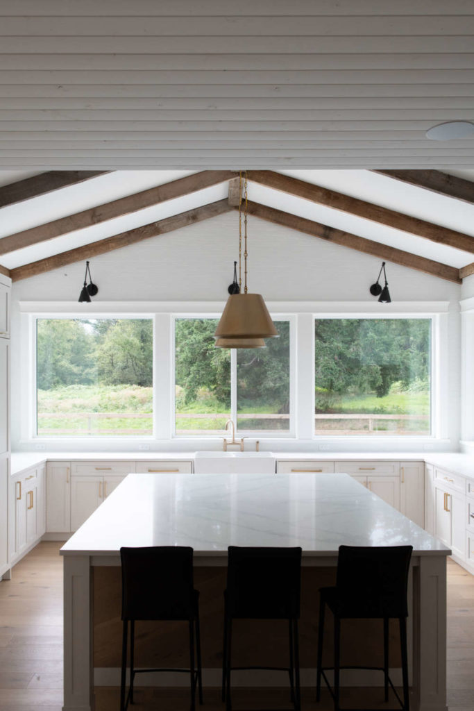
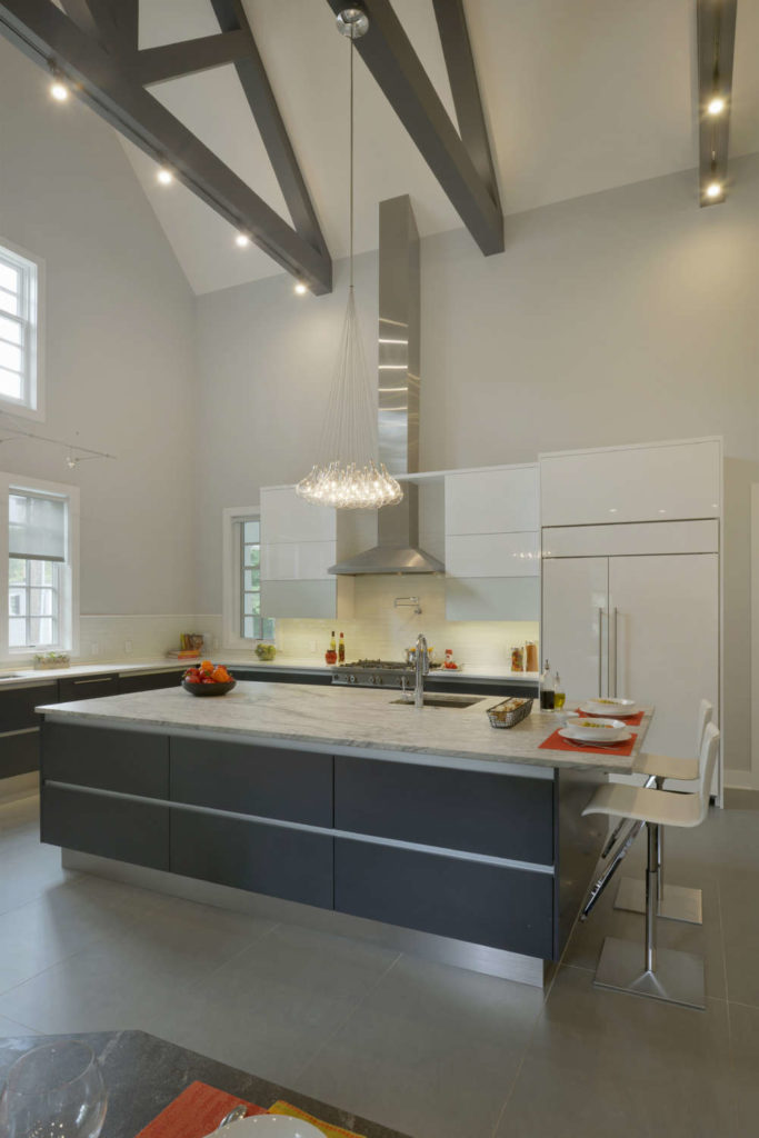
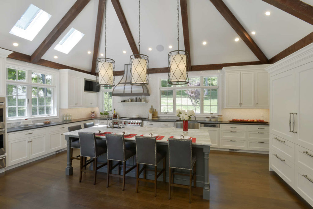
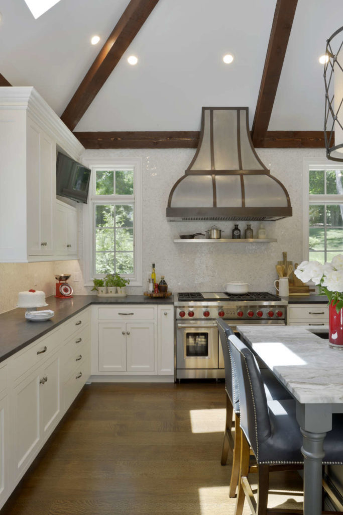
Have you ever walked into a church and been awed by the impressive exposed ceiling trusses on high? Usually this combination of rafters and beams is used as a support system for a roof. But in a kitchen by designer Aston Smith, trusses were employed as a decorative element.
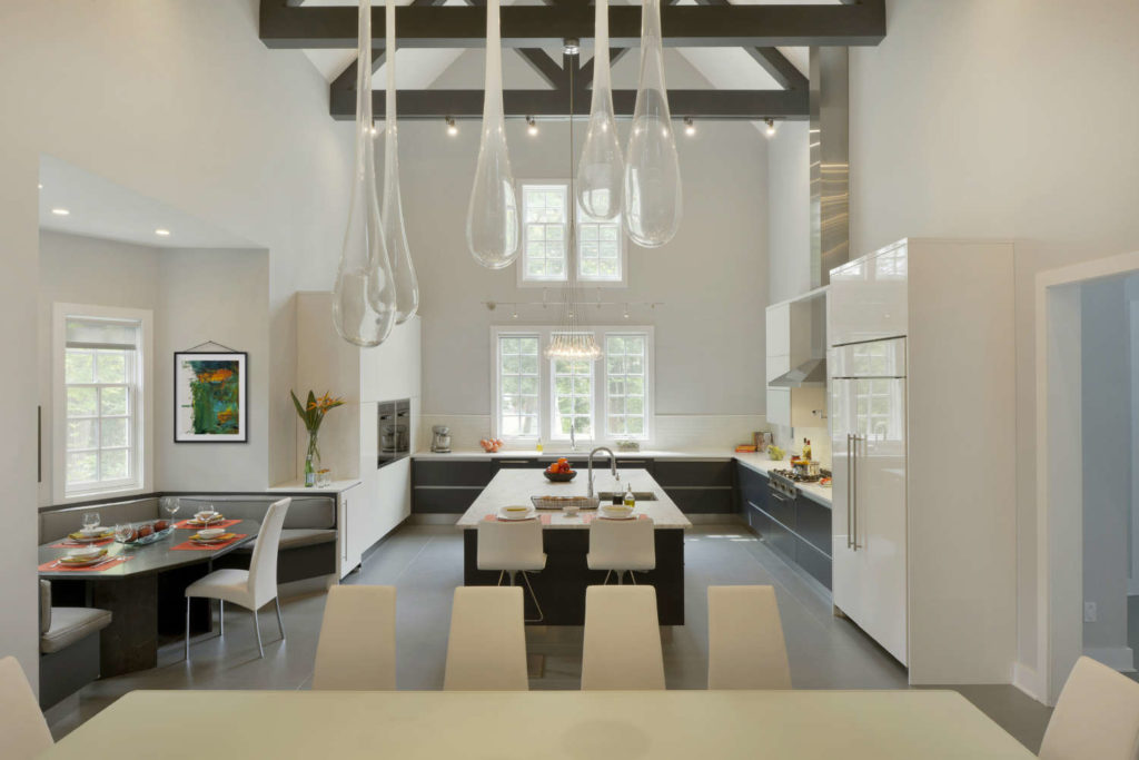
This new space was designed to incorporate kitchen, informal banquette seating, and formal dining areas for a family who spends all their time in their kitchen/great room. (There are actually four TV’s in the space so they can view multiple sporting events simultaneously!) The original concept was to have a vaulted ceiling that peaked at 26 ft high, with sleek cabinetry of dark bases and island combined with glossy white wall and tall cabinets. The banquette was also going to be a dark base and dark upholstery. But as construction progressed, they realized an unadorned vault was going to end up feeling cavernous.
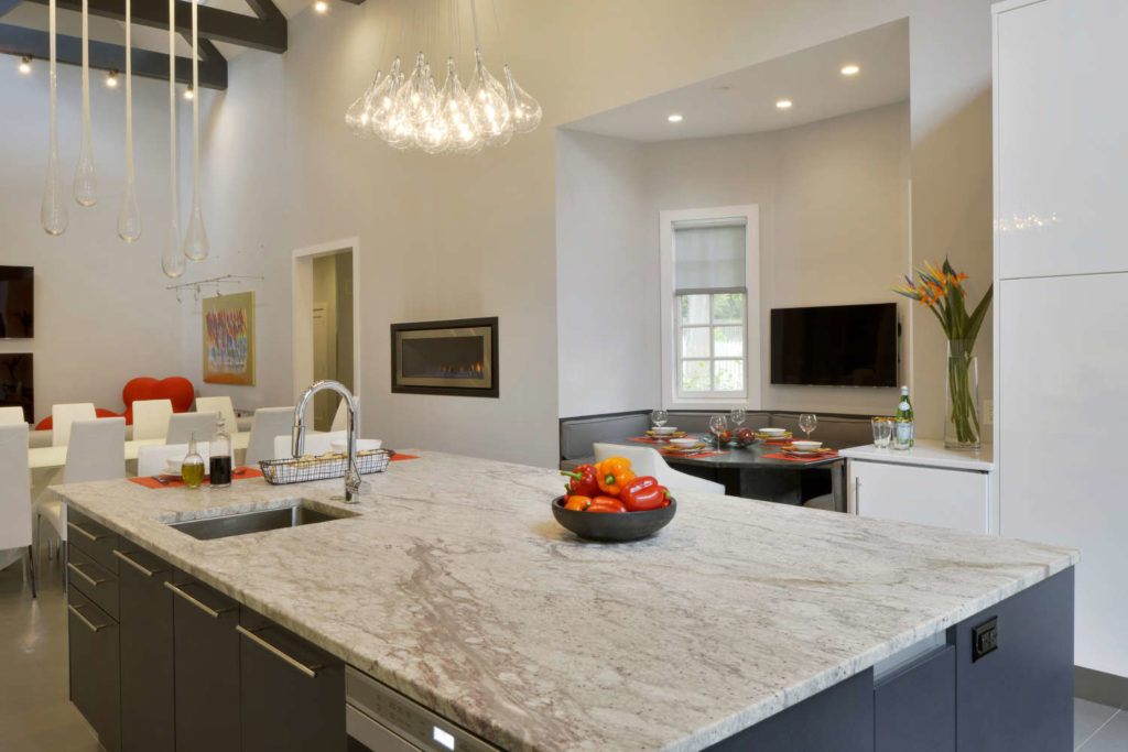
So they designed a series of dark wood trusses that would ground the space, relate it to the other dark elements in the room, and also integrate downlights and chandeliers. Aston carefully designed the layout so the hood would be perfectly centered between trusses. Now, when you enter the room, you can’t help but look up to appreciate the true cathedral ceiling effect.
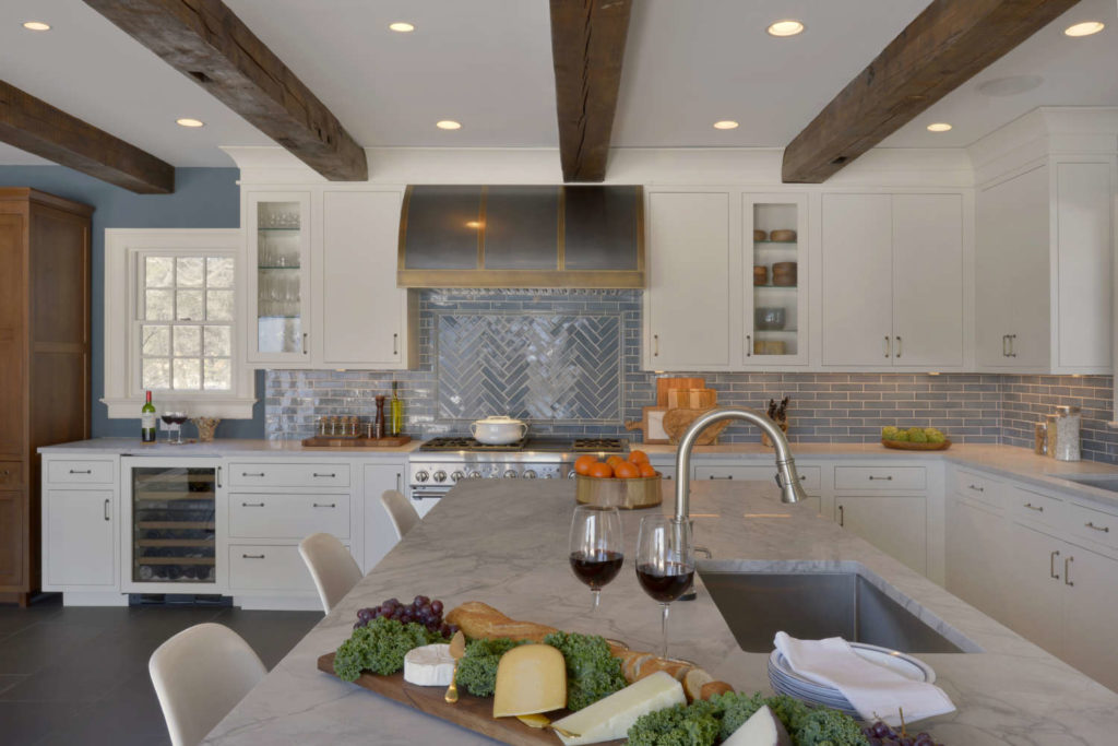
Wood beams are another effective device to add interest to a space. Sometimes they’re actually structural elements that are left exposed; sometimes they’re purely decorative; sometimes they’re a combination of the two.
In a kitchen I designed, necessity was definitely the mother of esthetic invention. An antique farmhouse with an enviable location overlooking the Hudson River, this home’s interior was a warren of small dark rooms that didn’t take full advantage of the views. Since the owners love to cook and entertain, their main objectives were to combine several rooms to open up the space, add more natural light, and maximize the views. Of course, the wall facing the river was opened up with a row of glass doors. But several of the walls that needed to come down were load-bearing, requiring support beams, and the ceiling structure made it impractical to implement flush beams. So it was decided that the real beams would be clad in reclaimed lumber, with additional fake beams added at even spacing to create the illusion that the entire room’s ceiling rafters had simply been exposed.
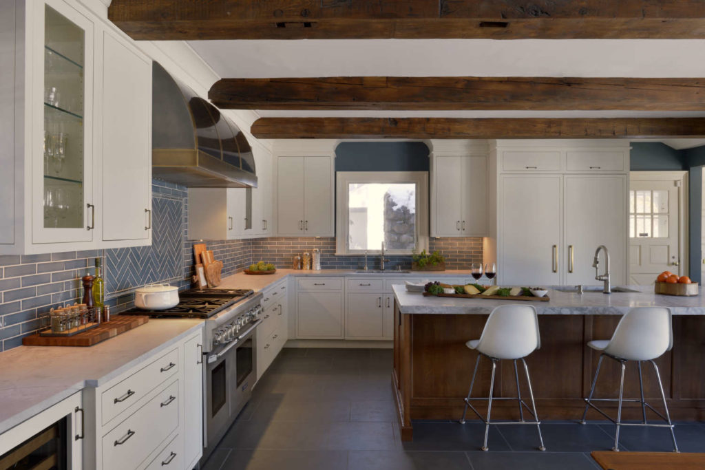
I planned the height of the cabinetry to terminate just below the beams, with a small trim molding going all the way around the cabinets. A fascia matching the cabinets, with a large but simple cove crown molding, butts up against the beams at the ceiling line. The result is a light-filled space that looks like an updated farmhouse kitchen – with drop-dead river vistas.
In a kitchen by designer Aston Smith and dtls Architecture, a combination of wood beams and a wood-covered ceiling perform a bit of architectural trompe l’oeil. In this case, the architect was the homeowner.
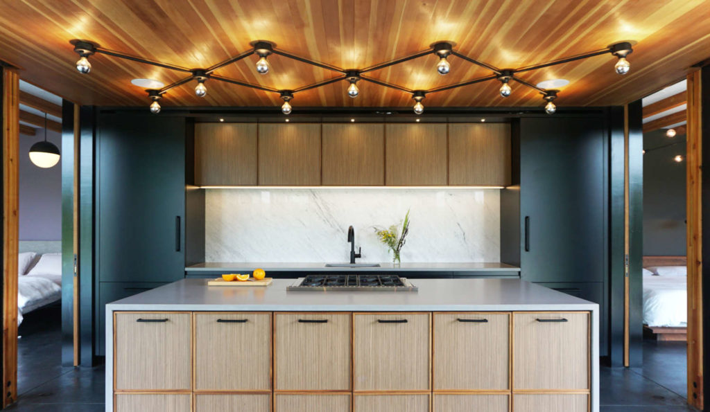
The home is nestled into the landscape atop a ridge in the Hudson Highlands. Upon approach, it appears inconspicuous until you enter and the grandeur of the setting unfolds. The kitchen is set between two separate bedroom wings and is surrounded by glass walls opening to mountain and pool views. Flanking the kitchen are two oversized roof overhangs with exposed joists. So in the kitchen, a header was placed to align with the outermost joists of the overhangs; within that footprint, natural heart pine planks cover the ceiling, parallel to the outdoor joists.
This creates the illusion that the overhang enters the kitchen at one end and exits on the other. In the dining area, beams are spaced parallel to the header, mirroring it. A unique bronze scissor-armed lighting fixture illuminates the work area, while a coordinating pendant hangs over the dining table. A perfect complement to the woodsy mountain site.
In our next example, we have another instance of “you can have too much of a good thing”. A vaulted ceiling in this kitchen by senior designer Paula Greer needed to be brought down to size, since the owners felt it just floated above the room. The solution was to add dark wood beams to give greater definition to the vaulted shapes. This included a ridge beam along the length of the peak; beams at the bottom of all the slopes; beams at the intersections of the angled ceiling planes; and additional beams interspersed between them.
Now the ceiling is anchored in the room and relates to the dark wood flooring, island cabinetry, and other finishes in adjoining rooms. A clever touch can be found in the curvaceous custom stainless steel hood: bronze straps were placed horizontally and vertically to echo the ceiling treatment, tying everything together in a cohesive fashion.
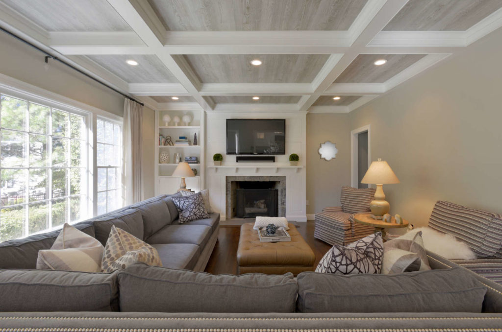
But after all these diverse ideas for accenting your ceilings, there was still one approach that was most frequently mentioned by our Bilotta designers. That approach is – drumroll please – coffers! (I’m also including tray and cove ceilings in this category, although they aren’t the same.)
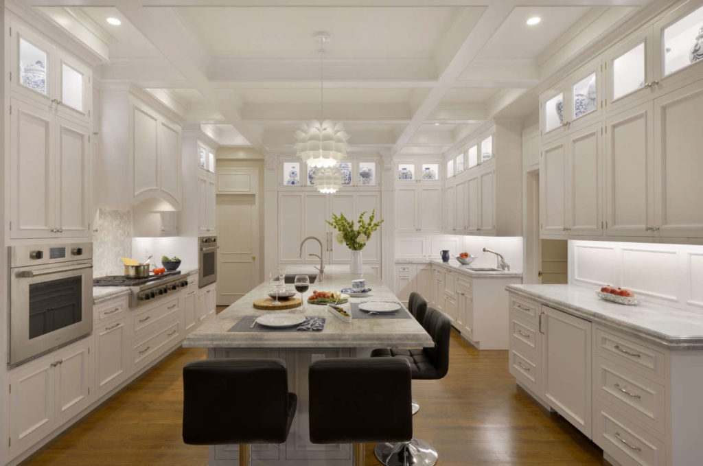
Designer David Arnoff summarizes the appeal of these forms. Not only do they add dimension to the space, but coffers, trays and coves are a great way to conceal LED lighting, which highlights the details of the structures and provides a softer indirect lighting source for the room. This can be seen in a front window display of our Mamaroneck showroom.
Coffers also provide separate spaces for inserting decorative elements such as beadboard, shiplap or even wallpaper, which are illustrated in some of the examples that follow.
Usually the designer has to convince the homeowner of the benefit of adding coffers to a room. This was not the case in a kitchen designed by senior designer Danielle Florie. When the homeowners bought their home, there were already coffers in the kitchen, but they were very poorly designed and executed. They loved the effect but wanted an improved version as part of their renovation. Many times, cabinetry does not extend all the way to the ceiling when there are coffers: cabinetry has its own crown molding and falls short of the coffers, which stand alone as a separate and distinct architectural feature. This client, however, wanted no empty space above the cabinets, so Danielle planned soffits directly above the cabinetry crown, then had the coffers begin at that point. Crown molding goes around the coffers as well as the edges of the soffits. Placement of the coffers allows for the island pendant lights to hang from the coffer.
Usually coffers are arranged in a geometric pattern: squares, rectangle, or even other geometric shapes. In a kitchen I designed, the ceiling treatment was part beam, part coffer. The concept originated as a solution to disguise two structural beams that remained from demolishing load-bearing walls, as well as to hide the fact that the ceiling over the dining area was lower than the rest of the room. The fabrication of the disguise was typical of most coffers, with a horizontal board attached to the vertical ones through grooves (called dadoes). Both were sized at the same distance above the floor, but the one at the dining area looks shorter on that side due to the ceiling height discrepancy.
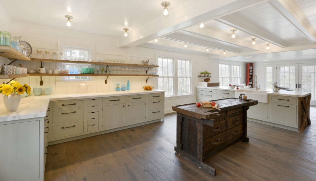
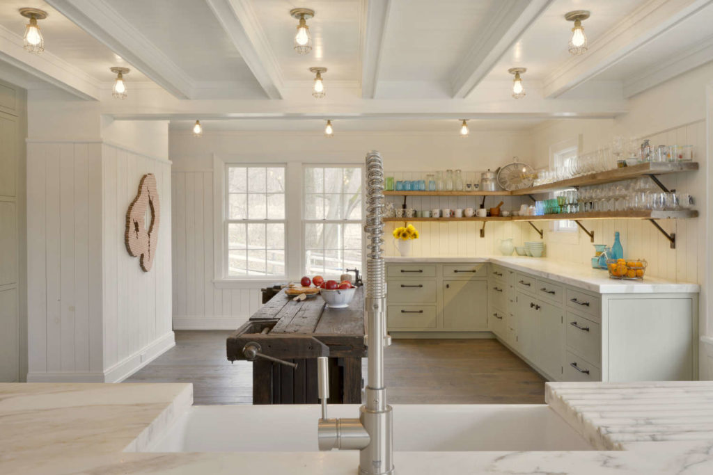
But instead of dividing the entire ceiling into rectangles, only the space between the two beams was filled, and only with coffered beams placed perpendicular to the two original ones. These intermediate beams are shorter than the other two, further concealing the different ceiling heights. The house is a working horse farm, and the owners sought a refined rustic look. They chose reclaimed wood for the custom crossbuck end at the peninsula and the open shelving, and an antique carpenter’s workbench to serve as an island. So it’s not surprising that they selected shiplap siding for the walls, which they also applied to all the ceiling surfaces.
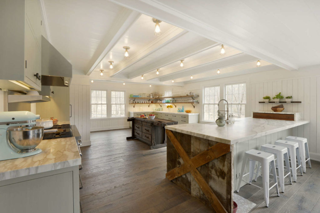
They eschewed ubiquitous recessed lighting and pendants in favor of a series of individual brass caged light bulbs that illuminate the space with an industrial edge.
Coffers don’t necessarily have to be large and intricately detailed with layers of moldings in order to be effective. A kitchen by senior designer Paula Greer included two different ceiling heights: a small section of an addition contained a vaulted ceiling, while the larger island and eating area was tucked under a 2nd floor balcony and bedrooms. They wanted to distinguish the lower area from the vaulted section, but in a subtle manner.
They chose to implement shallow coffers with minimal trim for a softer result. The geometric pattern also reflects the floor tile and other lines within the room. The most interesting aspect, though, is that the vaulted area is actually concealed from view when you’re standing in the breakfast area; but as you approach the sink and window, the ceiling explodes above you for a visual surprise.
The next examples of coffered ceilings are all courtesy of designer Fabrice Garson. It’s no wonder that all of us at Bilotta refer to him as the “Coffer King”! This first home combines several different treatments, all stemming from an existing condition of a pyramid-shaped skylight in the middle of the room.
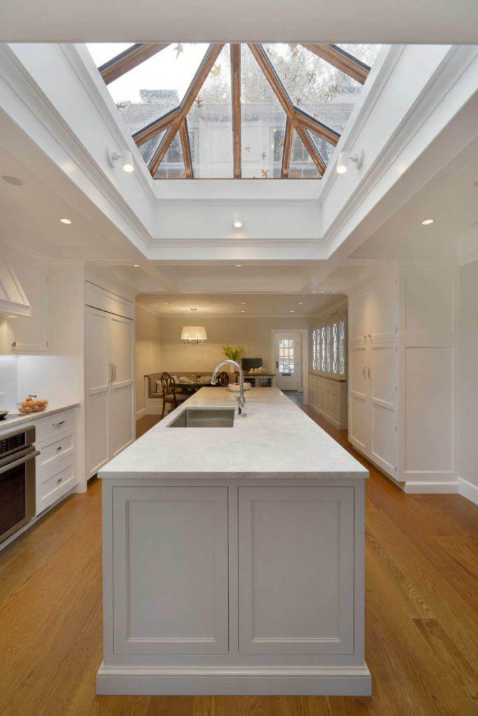
The first thing Fabrice did was design a tray feature around the skylight, then centered the island directly below it.
Next was the coffers, starting at the header between kitchen and breakfast area. Placement was carefully considered, with one coffer aligned perfectly with the refrigerator on one side of the room and an equal-sized pantry on the other. The hood is then perfectly centered between two other coffers for pleasing symmetry.
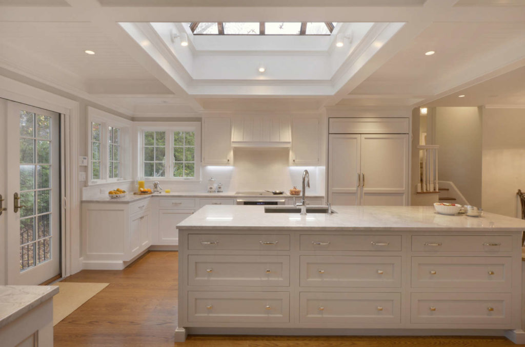
One more trick is used to add even more dimension: beadboard was applied to the ceiling between all the coffers. And although the breakfast area isn’t coffered, it also has a beadboard-covered ceiling to help visually join both rooms. Another unifying element is that the crown molding used in and around all the kitchen coffers is continued around the perimeter of the breakfast room.
If you get rid of your formal dining room in order to gain more square footage for your new kitchen, how do you ensure that the new space won’t end up feeling too casual? Designer Fabrice Garson added a coffered ceiling, of course! A young couple wanted to transform their dated 50’s “modern” kitchen, family room and dining room into a bright family-friendly space that could comfortably accommodate informal meals and activities with their kids, but just as easily play host to adult dinner parties. The coffers lend elegance to the room, while the navy blue island, blue upholstery on the banquette seating, and the cheerful blue oversized print on the banquette wallpaper keep it feeling fresh and fun.
While most coffered ceilings consist of a straightforward grid of fairly uniform squares, Fabrice’s grid varies in size and placement in order to highlight cabinetry elements in his layout. For example, the spacing is uneven in one area in order to align with the fridge and two equal pantries that flank it, with yet another size rectangle perfectly centered over the island. And the intersections of some rectangles are offset from one another in order to better draw attention to other areas, such as the dining table. Again, beadboard was used to cover the ceiling areas between the coffers for extra texture.
Recessed lighting, island pendants, and dining table chandelier were all incorporated into the coffers’ grids for a bright open atmosphere. Since Fabrice coordinated the coffers with the cabinet layout, he was able to achieve a cohesive overall design. So many classic elements, mixed with lighthearted touches, resulted in a flexible, sophisticated entertaining space with a youthful personality.
Once you experience the transformative effect of coffered ceilings, it’s difficult to resist the temptation to go coffer crazy in other areas of the house. That’s exactly what happened with Fabrice’s client, who started out with coffers for their kitchen/breakfast room/living room renovation, then decided to add them to the master bath and bedroom suite as well. The first order of the day was to open up the kitchen, breakfast room, and living room to create one large, spectacular party-perfect space. Fabrice enlarged the openings to all the rooms, but remaining support headers threatened to interrupt the flow.
Additionally, the kitchen contained three doorways, further chopping up the space. Deep coffers with crown molding not only helped to disguise the headers, but they also unified the three rooms and distracted from the kitchen doorways. Fabrice took the cabinets and their crown all the way up to a perimeter soffit, from which all the coffers originate. Two slender fluted columns sit beneath the header between the kitchen and breakfast rooms. Two fluted pilasters with capitals mark the header between the breakfast room and living room; two more pilasters flank the dual refrigerators, creating a focal point at the far end of the room. As always, Fabrice’s placement and spacing of the coffers relates directly to the cabinet layout below. Because both were planned simultaneously, the whole room became one integrated design as opposed to cabinets and crown sitting below an independent architectural element.
The master bath and bedroom in this same home boasted sloped tray ceilings, which Fabrice wanted to supplement with coffers. He could have merely designed a standard grid, as he did for the bedroom.
Instead, he chose the unique scheme of a diamond shape as the centerpiece of the ceiling.
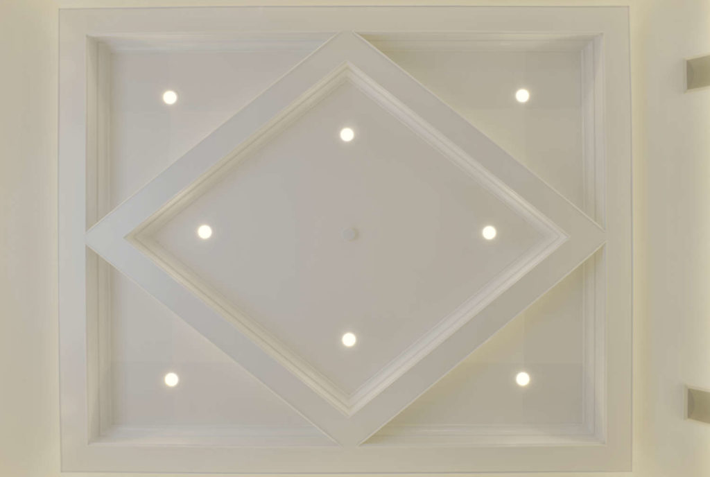
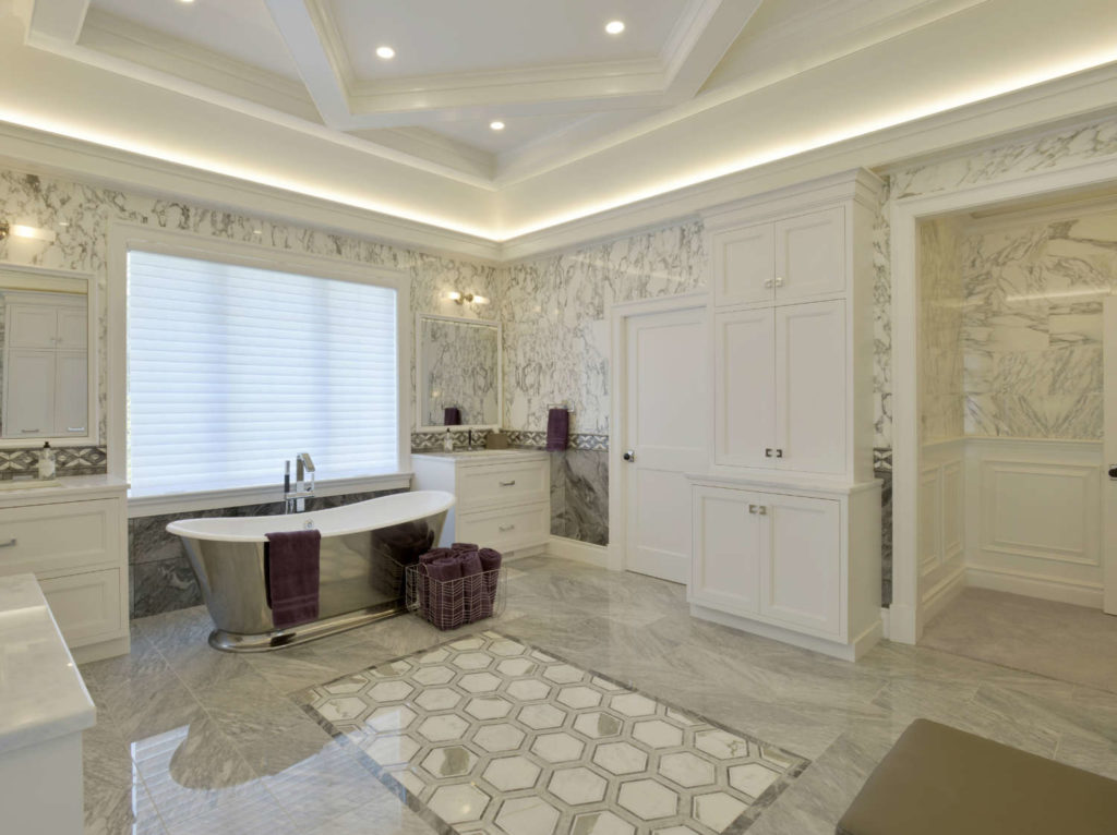
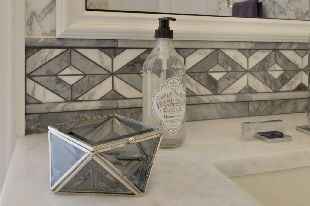
This mimics the diamond-shaped tile pattern that he created for the room’s border and also ties into the hexagonal pattern of the bathroom’s tile “rug” lying directly below it.
In both the bathroom and bedroom, a stack of crown moldings was placed at the bottom of all the tray slopes to conceal LED lighting. Another example of beautiful ceiling designs that tie into all the other elements in the rooms!
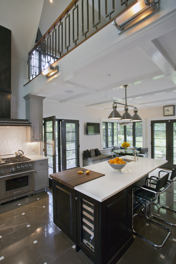
And finally we present to you the culmination of coffer creativity from designer Fabrice Garson. The challenge in this house was a very long kitchen with a family room at one end. To provide balance to that family room, Fabrice created a banquette at the opposite end, tucking it into the corner. Convenient beverage/wine refrigerators were placed in a handy location adjacent to the banquette.
Between the dining end and family room end is a long workhorse island that houses sink, dishwasher, trash pullout, and microwave drawer plus additional storage. Centered on the wall opposite the island is a 48” professional range, bookended by tall pantry storage and a 48” refrigerator/freezer. By now it should come as no surprise to you that Fabrice positioned the coffers to reflect the kitchen layout: a long single coffer section centered over the island, with pendants centered within it; other coffers placed to frame the hood, the pantry and the fridge. But the surprise genius stroke was over the breakfast table. Since the table was round, Fabrice pivoted a square at a 45 degree angle directly over the table, with no worry whatsoever that the diamond wasn’t centered on the room; it was more important that it be centered over the table, and the rest of the coffers at that end were worked around the diamond.
The coffers continued on into the family room to connect the two spaces. Here they took on a more conventional grid pattern, but with the twist of a wood-patterned wallpaper in weathered gray tones to create a more relaxed feeling for this casual space. Naturally, the coffers were placed to align with the fireplace surround, which Fabrice also designed to coordinate with the adjoining kitchen.
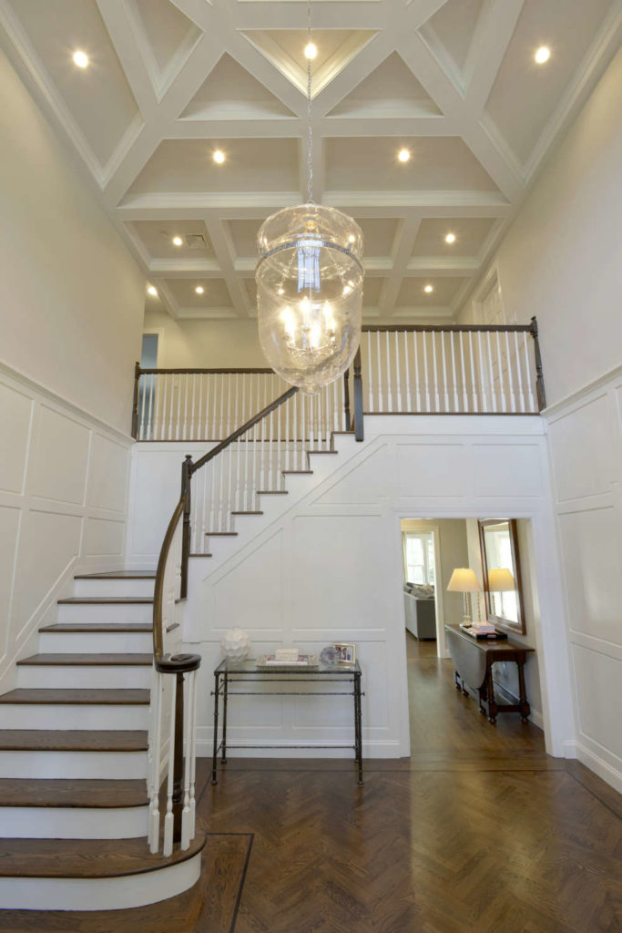
But the most dramatic application of coffers was in the two-story entry of this same residence. To relate this ceiling to the kitchen, Fabrice devised a square-within-a diamond-within-a square motif. This is centered in the double-height area, with the coffers continuing over the second story balcony. This is a breathtaking welcome for all who enter!
Snoopy once said, “Keep looking up…That’s the secret of life”. After seeing all these exceptional ceiling treatments, it’s apparently also the secret to finding new inspiration for your kitchen or bath renovation. Have fun!
This post was written by senior designer, Paulette Gambacorta. Paulette has been designing kitchens with Bilotta for over 25 years.